Cutlery Caddy Redesign: helping students and staff across campus
- Role
- User Researcher + Designer
- Timeline
- 5 weeks
- Team
- Team of six designers
- Tools
- Live observations, Google Sheets, Procreate, Figma

Overview
Overview
UC San Diego’s dining hall cutlery caddies consistently cause user errors. Students hesitate, grab the wrong utensil, pick up several at once, or lean over the bins to figure out what’s inside.

The Problem
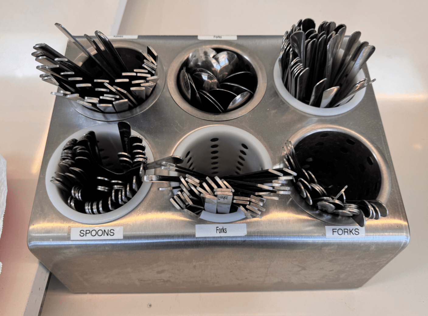
Every dining hall cutlery caddy looks the same: identical metal cylinders, a few labels, and utensils face down with their identical handles sticking up. Students can’t tell what’s in each bin without leaning over, and the labels often don’t help, because workers misplace utensils and the labels don’t always match what’s inside.
We framed the project around two questions: how might we make it easier for students to grab their intended utensil, and how might we make it easier for dining hall workers to restock the right utensils in the right caddies?
Discovery
I helped design a standard interview protocol so all six of us collected comparable data. We ran 18 interviews across five dining halls and markets, each team member interviewing three students, using a master-apprentice approach: we watched students grab utensils naturally, then asked them to talk us through it. I independently collected our 35 live observations at Pines Dining Hall, coded with a structured sheet that tracked hesitation, wrong grabs, multiple grabs, and leaning over the bins.
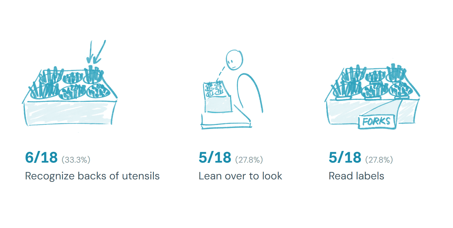
The data showed that students used three cues to find the right utensil: the backs of the utensils (6 of 18), leaning over to look (5 of 18), and reading labels (5 of 18). Some of those labels were wrong or unhelpful, and 7 of 18 interviewees made, or admitted to frequently making, a mistake. Students needed an average of 2.5 attempts to grab their intended utensil, and only 13 of 35 (37.1%) got it on the first try. Cleanliness wasn’t the cause: students rated it 3.8 out of 5, with no score below 3. And forks dominated demand. 29 of the 44 utensils we saw taken were forks, and 4 of 15 students said the utensil they wanted was missing.
We concluded that the caddy’s problem wasn’t holding utensils or the cleanliness of it. It was the gulf of execution: students couldn’t tell where their utensil was before they reached in. That led to two types of errors: knowledge-based mistakes from mislabeled or unmarked bins, and description-similarity slips from relying on weak cues like handle thickness.
Iterations
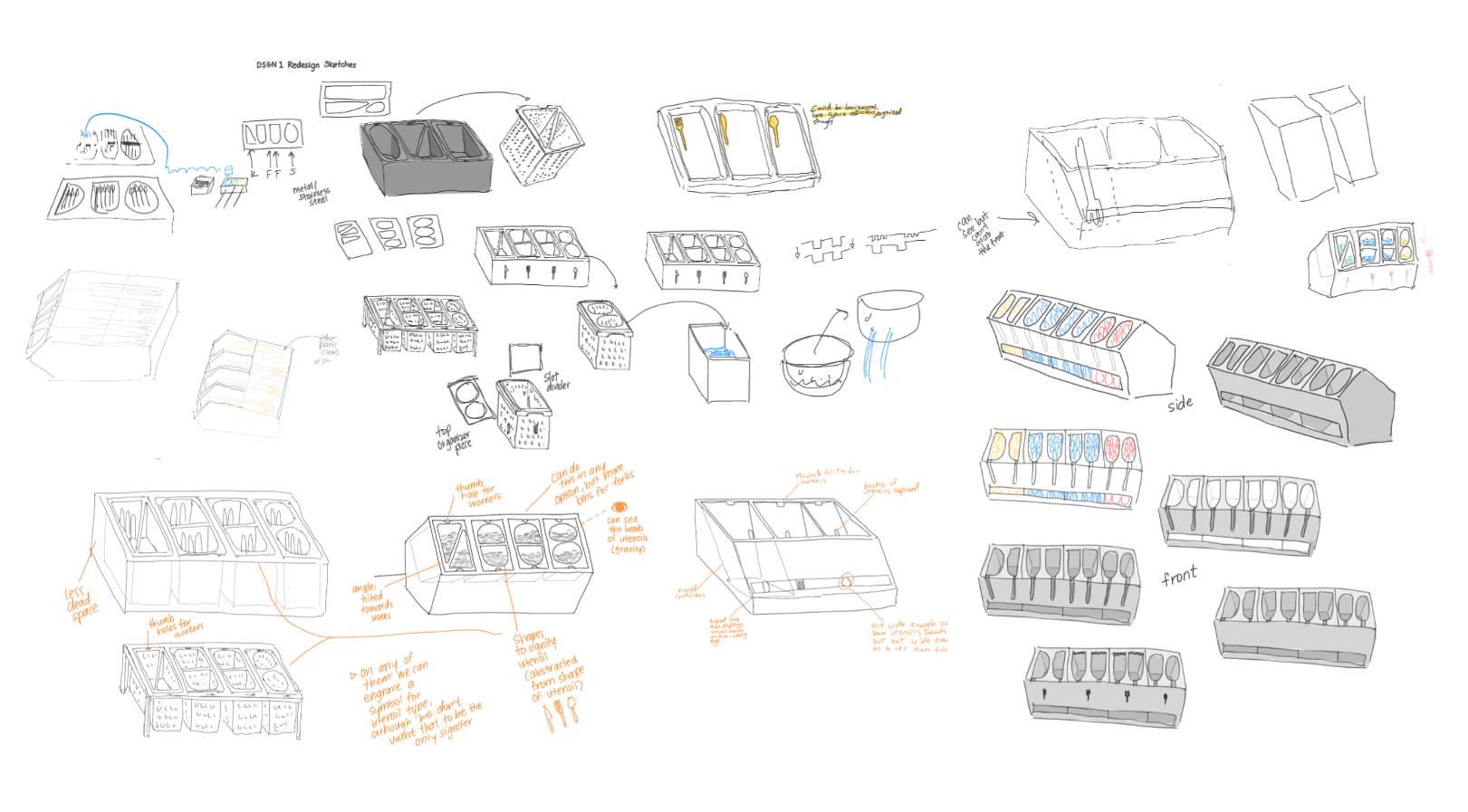
For our first iteration, two of our designers made caddies in representational shapes. A triangle for the knife, a semicircle for the fork, and an oval for the spoon, but the empty space around them reduced how many utensils each bin could hold, so we squared the shapes off and kept them distinct.
We also explored ideas we ultimately dropped. A modular caddy would let students return utensils to a matching dirty caddy and workers pull inserts straight into the dishwasher, but it didn’t solve the problem we were studying and relied on students returning utensils correctly. Adding colored bands or shapes to the utensils themselves would have been costly for the university and wouldn’t encourage workers to sort correctly.
Delivery
The final caddy is a pentagonal prism tilted toward the user, with four signifiers working together: utensil-shaped cutouts, icons on the front, a slit that shows utensil heads, and the tilted angle that lets gravity pull utensils down and reveals what each bin holds. The slit is thin enough to act as a physical constraint, so people don’t grab utensils by their heads.
Because labels alone had already failed at the dining halls, we layered signifiers rather than relying on any one. The distinct cutouts also show workers what’s missing when a bin runs empty. Based on our demand data, half the bins hold forks and the rest are split evenly between knives and spoons.
Impact
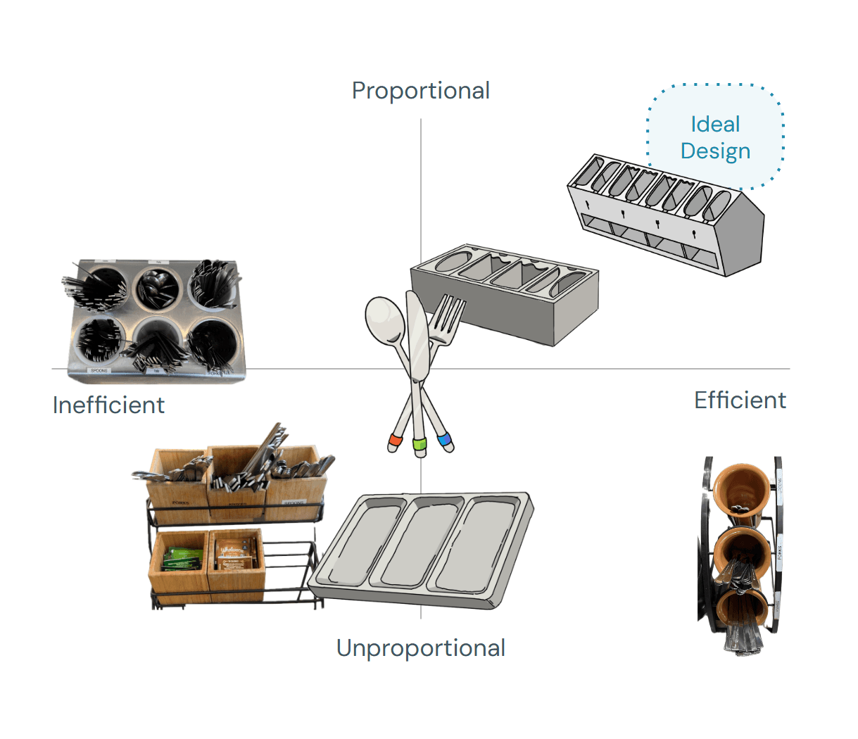
In our design space evaluation, the redesign scored 4 out of 5 on both proportionality and space efficiency, and 5 out of 5 on identifiability, with a tradeoff on expense (1). The project earned 100% and was called the best in the class.
Every design decision traces back to something we measured. The tilt and slit address the students having to lean over, the cutouts and icons address mislabeling, and the fork-heavy layout addresses the demand we observed.
What's Next
Our next step is to design the prototype in a CAD software and then get it 3D printed. Then, we plan on contacting UC San Diego’s Housing, Dining, and Hospitality department to present our prototype and test it in a real dining hall on campus.